10 logo’s gone wrong
When starting a company, website or business, it’s a good thing to have a logo. Preferably something people will recognize and remember. At Reasonish we have a feather, to indicate the writing part, for instance. Luckily for us, a blog is not such a difficult thing to choose a logo for. Other businesses might have less luck. A logo can go horribly wrong, sometimes with pretty funny results. We’ll take a look at the worst logo’s that actually exist or existed.
10 logo’s gone wrong. You’d almost think some of these are intentional.
1 Arlington Pediatric Center

This is wrong on so many levels…
2 Catholic Church’s Archdiocesan Youth Commission

Um… No. Just… NO.
3 A-Style
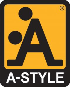
Doggystyle
4 Pepsi (older version vs 2008-version)

Can you see a fat, protruding belly in the new logo?
5 Institute Of Oriental Studies

Yes… insert it right there…
6 Junior Jazz Dance Classes

Spot the female torso in this logo.
7 Kudwara Pharmacy

Taking it from behind?
8 Megaflicks

Fonts matter.
9 Safe Place
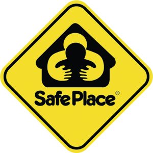
It feels rather suffocating, though.
10 Kids Exchange
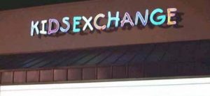
The words ‘kid’ and ‘sex’ should never appear that close together.



Leave a Reply
Want to join the discussion?Feel free to contribute!